
Why Brand Consistency Matters More Than Ever
In today’s digital-first world, customers interact with brands across multiple platforms and touchpoints. A lack of consistency can confuse audiences and reduce trust.
Here’s why consistency is so important:
Builds trust – People are more likely to trust brands that look professional and cohesive.
Improves recognition – Consistent visuals and messaging make your brand easier to remember.
Strengthens credibility – Clear branding suggests confidence, reliability and attention to detail.
Saves time and money – Designers, developers and marketers work faster when clear guidelines are in place.
Supports long-term growth – As your business scales, consistency ensures your identity remains intact.
For companies investing in professional web design in Bedford or collaborating with a design agency in Milton Keynes, consistency is often the difference between a website that simply looks good and one that actively builds brand equity.
Step 1: Define Your Brand Foundations
Before you design anything, you need clarity on what your brand stands for. A brand style guide should always start with strategy, not visuals.
Clarify Your Brand Purpose
Ask yourself:
Why does your business exist?
What problem do you solve?
What value do you provide that others don’t?
Your purpose should be simple, clear and authentic.
Define Your Brand Values
Brand values guide how your business behaves and communicates. These values should influence:
Visual style
Tone of voice
Customer experience
Decision-making
Choose three to five core values and describe what each one means in practice.
Identify Your Target Audience
Understanding who you’re speaking to is critical. Consider:
Demographics (age, location, profession)
Psychographics (values, motivations, challenges)
What they expect from a brand like yours
This insight ensures your style guide supports communication that resonates with the right audience.
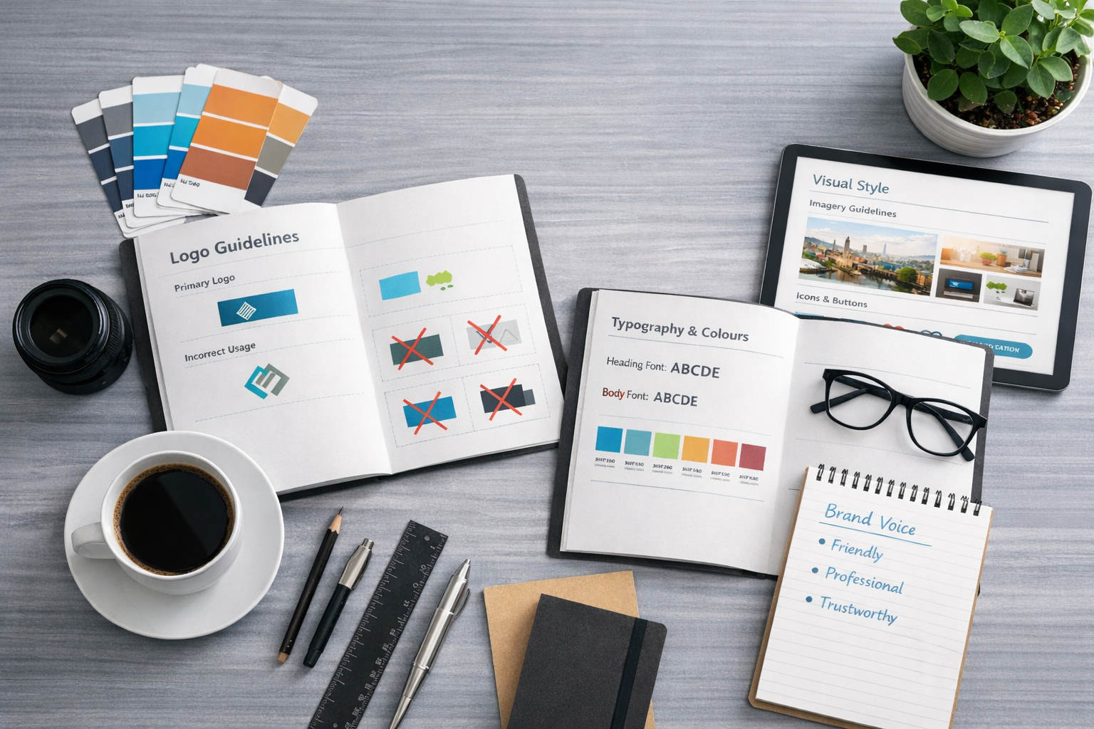
Step 2: Establish Clear Logo Guidelines
Your logo is often the most recognisable element of your brand, which makes consistent usage essential.
Logo Variations
Your style guide should include:
Primary logo
Secondary logo (stacked or simplified)
Icon or symbol-only version
Clearly explain when each version should be used.
Clear Space & Sizing
Define minimum clear space around the logo to ensure it remains legible and uncluttered. Also include minimum size requirements for print and digital use.
Incorrect Usage
This is often overlooked but extremely important. Show examples of:
Stretching or distorting the logo
Changing colours
Adding shadows or effects
Placing it on conflicting backgrounds
By showing what not to do, you prevent misuse.
Step 3: Choose a Consistent Colour Palette
Colour plays a huge role in brand recognition and emotional response.
Primary and Secondary Colours
Your brand style guide should clearly define:
Primary brand colours (used most frequently)
Secondary or accent colours (used sparingly for highlights)
Include:
HEX codes for digital
RGB values for screen use
CMYK or Pantone references for print
Colour Usage Rules
Explain how colours should be used across:
Websites
Social media
Marketing materials
Backgrounds and text
For businesses focused on web design Bedford clients, ensuring colour accessibility (contrast and readability) is also essential for usability and compliance.
Step 4: Define Your Typography System
Typography is one of the fastest ways to either elevate or weaken your brand.
Primary Typeface
This is your main font, used for headings and key messaging. Explain:
Font family
Weight options
Where it should be used
Secondary Typeface
Often used for body text, captions or long-form content. This font should complement, not compete with, your primary typeface.
Usage Guidelines
Include:
Heading hierarchy (H1, H2, H3, etc.)
Line spacing and letter spacing
Do’s and don’ts (e.g. avoid excessive capitalisation)
Clear typography rules are particularly important for websites, where consistency directly impacts readability and user experience.
Step 5: Set a Clear Tone of Voice
Your brand’s tone of voice defines how you sound, not just what you say.
Describe Your Brand Voice
Use simple descriptors such as:
Professional but friendly
Confident and authoritative
Conversational and approachable
Avoid vague terms and explain what they mean in practice.
Writing Guidelines
Provide examples of:
Words or phrases you commonly use
Language to avoid
Sentence length and structure
Adapting Tone Across Channels
Your tone may flex slightly depending on the platform, but it should never lose its core personality. A social media post, for example, may be more relaxed than a legal page on your website, but both should feel like the same brand.
Step 6: Define Imagery and Visual Style
Imagery has a powerful influence on how your brand is perceived.
Photography Style
Clarify:
Colour vs black-and-white
Natural vs staged photography
Lighting preferences
Composition and subject matter
Illustration & Iconography
If your brand uses illustrations or icons, define:
Stroke weight
Level of detail
Colour usage
Style consistency
These guidelines ensure visual harmony across digital and print materials.
Step 7: Apply Your Style Guide to Digital & Web Design
A brand style guide is especially critical for websites, where multiple elements come together at once.
Website UI Elements
Include guidance for:
Buttons and call-to-actions
Forms and inputs
Navigation styles
Spacing and layout principles
Accessibility Considerations
Modern web design should always consider accessibility:
Sufficient colour contrast
Readable font sizes
Clear hierarchy and structure
For businesses seeking web design in Bedford or nearby areas, accessibility is not just best practice – it’s essential for inclusivity and user trust.
Step 8: Make Your Brand Style Guide Practical
A style guide should be a living document, not something that sits unused in a folder.
Keep It Clear and Usable
Avoid unnecessary jargon. Use:
Clear explanations
Visual examples
Simple layouts
Make It Accessible
Your guide should be easy for:
Designers
Developers
Marketers
External agencies
Many businesses now host their style guide digitally for easy updates.
Review and Update Regularly
As your business evolves, your brand may need to adapt. Review your style guide annually to ensure it still reflects who you are and where you’re going.
Why a Professional Design Agency Makes a Difference
While some businesses attempt to create brand style guides internally, working with a professional design agency often results in a more strategic, polished outcome.
A design agency doesn’t just focus on aesthetics. They consider:
Brand positioning
User perception
Digital performance
Long-term scalability
For companies working with a design agency Milton Keynes or looking for expert web design Bedford services, a professionally developed brand style guide ensures consistency across every touchpoint – from websites and social media to packaging and print.
Final Thoughts: Consistency Is a Competitive Advantage
A strong brand style guide is not about restricting creativity. It’s about creating clarity. When everyone involved in your business understands how your brand should look and sound, creativity becomes more focused, effective and impactful.
In a crowded marketplace, consistency builds familiarity. Familiarity builds trust. And trust drives growth.
If you want your brand to stand out, scale confidently and present a unified identity across all platforms, investing time (and expertise) into a comprehensive brand style guide is one of the smartest decisions you can make.