Half a Million for a Tweak? Is the New gov.uk Logo a Branding Disaster?
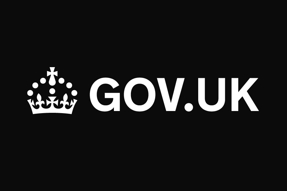
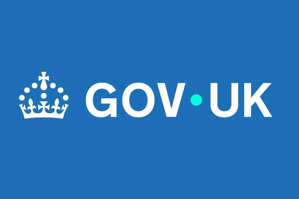
When news broke that the UK Government spent £500,000 on a new gov.uk logo, the design industry collectively raised an eyebrow. Half a million pounds. For what, exactly? To most eyes, the new logo looks barely different to the old one. In fact, unless you work in typography, you’d be forgiven for thinking nothing changed at all.
At Cosanostra Design, we live and breathe branding. We know design is an investment, and good design is worth paying for. But what we cannot stand is money being squandered on non-changes dressed up as strategy. Let’s be blunt: the gov.uk logo update is a masterclass in waste. It’s exactly the kind of bloated, opaque project that gives the design industry a bad reputation with the public.
This blog is our take on the debacle. We’ll unpack why this “refresh” is laughable, what real branding work should deliver, and why businesses of any size deserve better than smoke-and-mirrors design spend.
1. Let’s Call It: A £500,000 Logo That Looks the Same
Andy Sahota summed up the public reaction in his viral LinkedIn post:
“£500,000 on a logo?! The UK government has just spent half a million pounds designing a new logo. From what I can see… the font is the same.”
And he’s right. The average person sees the “before” and “after” and shrugs. The changes are so minimal they’re practically invisible.
That’s the core problem: the UK government has shelled out taxpayer money for something nobody notices. When branding becomes an exercise in hair-splitting refinements rather than meaningful impact, you’ve lost the plot.
Let’s be real. If a client came to us and we charged them half a million pounds to move some pixels and nudge a font weight, we’d expect to be laughed out of the room.
2. Invisible Design vs. Wasteful Design
Now, to be fair: not all design is about big, bold change. Some of the best design is invisible. Sometimes subtle refinements — kerning adjustments, screen optimisation, accessibility tweaks — make a huge difference. We’ve done it ourselves for clients.
But here’s the difference:
Invisible design should solve visible problems. It should improve legibility, consistency, or accessibility in ways that matter.
Invisible design doesn’t justify half a million pounds. Especially not when the improvements are imperceptible to most users.
The gov.uk logo changes don’t appear to tackle pressing issues. They don’t suddenly make government websites easier to use. They don’t clarify messaging. They don’t strengthen public trust. All they do is… look nearly identical.
That’s not invisible design. That’s waste.
3. What Half a Million Should Buy You
Half a million pounds in design terms is an enormous budget. Here’s what that money should get you if spent properly:
Full brand strategy: Vision, mission, positioning, tone of voice.
Comprehensive identity system: Logo suite, colour palettes, typography, iconography, digital assets.
Accessibility auditing: Ensuring everything meets WCAG standards across all digital services.
Implementation toolkit: Guidelines, templates, training materials, rollout plans.
Migration support: Updating signage, websites, stationery, and templates across hundreds of departments.
Public transparency: A clear explanation to taxpayers of what changed, why it matters, and how it improves their experience.
That’s what £500,000 should look like. Not a font tweak and some new stationery.
4. The Real Cost Isn’t Just the Design Fee
Of course, defenders of the project will argue: “It’s not just a logo file. It’s the rollout, the guidelines, the testing.” And yes, a rebrand at scale involves complex logistics. We’re not naïve about that.
But let’s be honest. The end product sets the tone for the whole project. If the logo itself looks unchanged, people will assume — fairly — that the whole thing was a pointless exercise.
The invisible behind-the-scenes work doesn’t absolve you from showing visible value. If the UK government genuinely needed to spend half a million to roll out a brand, then they should have at least delivered something recognisably improved.
5. Why This Matters: Public Trust & Perception
This isn’t just about design purists quibbling over kerning. It’s about public trust.
Taxpayers look at the new gov.uk logo, compare it to the old one, and see no difference. The conclusion? “Government wastes our money.”
And that perception is toxic — not just for government, but for the entire design industry. It reinforces the stereotype that design is fluff. That designers are snake-oil salesmen who move pixels for extortionate fees.
As an industry, we cannot let this slide. Because every time a project like this makes headlines, every designer and agency has to work harder to prove their worth to clients.
6. What Businesses Can Learn from This Debacle
So, what lessons should businesses and organisations take away from the gov.uk rebrand? Here’s our straight-talking guide:
a) Demand transparency
If you’re spending serious money on design, you deserve a clear breakdown of deliverables. “Logo design” alone isn’t enough. You need to know what’s included: strategy, guidelines, implementation, training.
b) Insist on visible impact
Subtle refinements are fine, but only if they solve real problems. Don’t pay for change that nobody can see or feel.
c) Protect your equity, but don’t fear evolution
If your logo already has recognition, don’t throw it out. But evolution should still be noticeable. It should look like progress, not déjà vu.
d) Value doesn’t mean cheap - but it does mean justified
Good design costs money. We’re not arguing for bargain-basement logos. But fees must match the value delivered.
e) Rollout is part of branding, but it isn’t all of it
Implementation is essential, but it shouldn’t overshadow the creative. If your budget is 90% rollout and 10% design, you’re doing it wrong.
7. The Cosanostra Design Way: Substance Over Smoke & Mirrors
At Cosanostra, we’ve built our reputation on cutting through the nonsense. We don’t sell inflated processes. We don’t charge for work that doesn’t move the needle. And we certainly don’t deliver “spot the difference” logos for six-figure sums.
Here’s how we approach branding differently:
Lean & transparent: You see where every pound goes. No smoke, no mirrors.
Impact-driven: If it doesn’t create real value, it doesn’t make it into the project.
Design with guts: We’re not afraid to make bold changes when they’re needed. Design should mean something.
Accessible to all: Whether you’re a startup or a global brand, our process scales. It’s not about size of budget, it’s about clarity of outcome.
In short: we believe in giving clients work they can be proud of — and that their audiences can actually notice.
8. What We’d Have Done for gov.uk
If gov.uk had come to us, here’s how we would have tackled it:
Audit the brand: What works, what doesn’t? Where are the pain points for citizens interacting with government services?
Define the brief: Is this about legibility? Modernisation? Digital-first consistency?
Propose meaningful evolution: Keep the recognisable elements, but update with intent — sharper typography, stronger accessibility, clear digital adaptability.
Show the difference: Present a before/after that makes sense. Explain why the changes matter for the user.
Roll out smartly: Phase the implementation, prioritise high-impact touchpoints, avoid waste.
Communicate to the public: Create a short case study explaining exactly where taxpayer money went and what value it delivers.
That’s how you spend branding money responsibly. That’s how you build trust instead of ridicule.
9. Conclusion: Design Should Never Be a Punchline
The gov.uk logo saga is a warning sign for all of us. Design matters — but only when it delivers. When it doesn’t, it becomes a punchline.
Spending half a million pounds for a logo that looks the same undermines trust in government and damages the credibility of our entire industry.
At Cosanostra Design, we’re not afraid to say it: the gov.uk rebrand is ridiculous. It’s a waste of taxpayer money, and it sets the wrong example of what branding should be.
Our pledge to clients — whether you’re a local startup or a national organisation — is this: we’ll never take your money for invisible change. We’ll deliver branding that works, branding that moves people, branding that earns its keep.
Because good design isn’t about spending more. It’s about spending wisely.


