
Most Controversial Packaging Redesigns
One of the biggest challenges in marketing is reinvention, as you need to ensure that your designs fit your company’s modern values and ideals whilst also respecting a brand’s extensive and celebrated heritage. As there is an original to compare to, this can make brand decisions made in conjunction with a marketing agency more important than establishing a brand, as there is more to lose. In many cases, brands either thrive in the face of this challenge or play it safe by retooling what has already worked for other brands. In some cases, however, brands redesign their packaging in a way that creates somewhat heated debate and controversy, which can be positive in some cases and devastating in others.
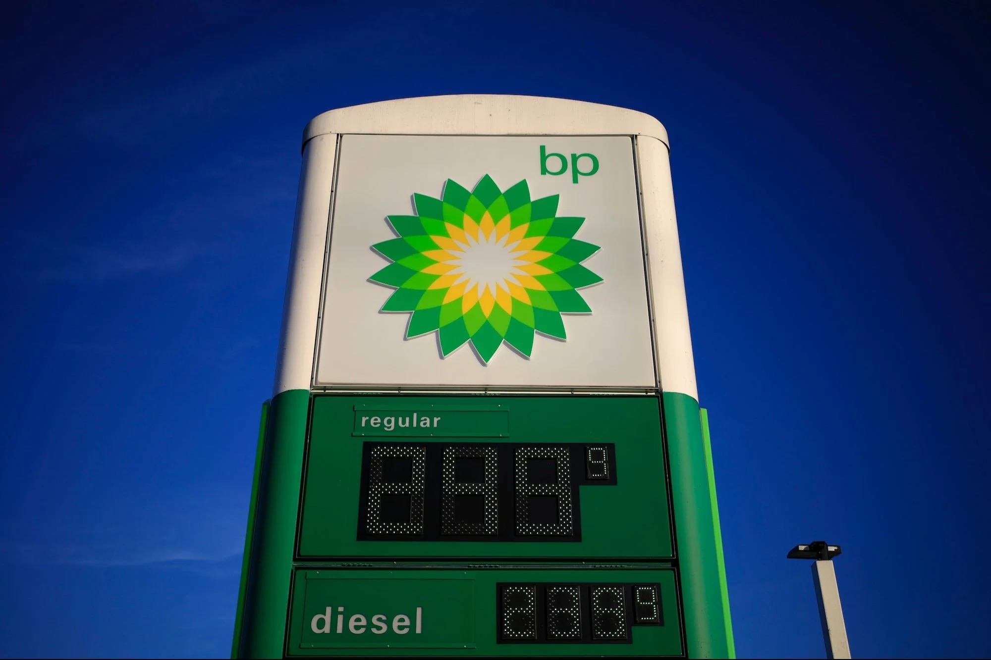
The BP Helios Logo
Before the former British Petroleum became embroiled in one of the most devastating man-made ecological disasters in history, BP’s brand had struggled with its image in the face of a more climate-conscious age. In 2000, BP changed its name to “Beyond Petroleum” and its famous green shield emblem to a helios symbol, both of which led to accusations of ‘greenwashing’, a term used when a company claims ecological credentials it did not deserve, even before Deepwater Horizon.
Tropicana
One of the most infamous marking disasters in modern retail, Tropicana’s ill-fated switch from its traditional orange-with-a-straw design to a more modern and honest look was one of the most immediately damaging rebranding moves ever seen, with sales dropping a fifth in just two months. Part of the problem was that Tropicana’s design was so iconic by 2008 that many retailers would borrow heavily from its aesthetic, and by changing it the leader of the pack looked, ironically, like a rip-off of itself.
Dairy Milk Bubbly
Some packaging redesigns only become controversial through the context and lens of loss, with people less angry about a new design but sad about losing an old one. Such was the case with Cadbury, who in an effort to consolidate their line of chocolate bars under the Dairy Milk name, launched the Dairy Milk Bubbly bar by discontinuing the popular Wispa line. Much like with New Coke, people were more annoyed about the loss of the old bar than the launch of the new one, and just four years later, Wispas were back on shelves. After some controversial, image-destroying years, the Wispa relaunch combined with one of the most famous and influential adverts of the last 20 years helped steady Cadbury long enough to be bought out by multinational conglomerate Mondelez.